How to override UI React components
Introduced in InvenioRDM v11
This documentation is targeted to developers who want to customize specific UI React components in an instance. For this guide, we assume that you are familiar with React and JavaScript.
Override React components
Experimental feature
You can now override React components following this guide. However, the overriding mechanism in InvenioRDM v11 is not finalized and it has a few limitations. Be aware that future releases of InvenioRDM might introduce breaking changes. We will document them as extensively as possible.
Use it at your own risk!
The UI of InvenioRDM is composed of classic HTML web pages for mostly static content, and React web apps for very dynamic content to enhance the user experience. While a dedicated guide describes how to override HTML web pages (Jinja templates), this guide focus on how to override React components.
InvenioRDM uses the React library react-overridable. The library provides a mechanism to mark React components as "overridable" by id.
Developers can define a map { id: Overridden React component }, which is then applied when each React component is rendered: the overridden component is rendered instead of the default one.
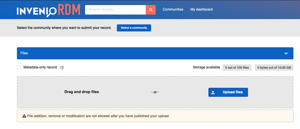
As example for this guide, you will learn how to override the UI React component in the upload form that marks a record as "Metadata only". More specifically, you will replace the "Metadata-only record" checkbox with a toggle, a "switch-like" component.
Steps
Identify how to override
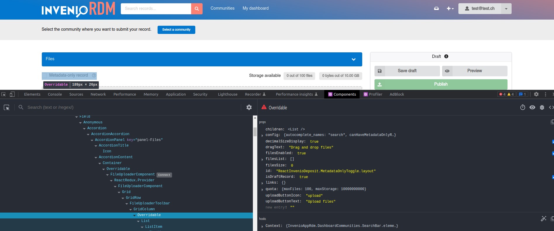
At the moment, the easiest way to understand how to identify if the component that you want to override is a classic HTML component or a React component is to use the Developer Tools in your browser (e.g. Chrome or Firefox DevTools). You can inspect the code and take advantage of some useful React browser extensions to select and inspect elements:
You can then find the component in the InvenioRDM modules source code, searching it in your local development environment or using the search feature in GitHub in the inveniosoftware organization.
You can always ask for help!
Find the React Overridable ID
The React component's overridable id for the 'Metadata-only record' checkbox component is ReactInvenioDeposit.FileUploaderToolbar.MetadataOnlyToggle.container. It can be found in the react-invenio-deposit module.
The mapping file
In a new InvenioRDM v11 or above installations, an almost empty file named mapping.js is available at the following path in your assets folder:
├── assets
|   ├── js
|   |   ├── invenio_app_rdm
|   |   |   ├── overridableRegistry
|   |   |   |   ├── mapping.js
For existing installations, you will have to create it. It is a very simple file:
export const overriddenComponents = {};
The const overriddenComponents is the map that will contain all your future overridden components.
New component creation
Let's create a new React component, very similar to the default FileUploaderToolbar, changing the UI component that will render. In the same file mapping.js, add the following code above the const overriddenComponents:
  import React from "react";
  import { Checkbox } from "semantic-ui-react";
  import { useFormikContext } from "formik";
  import PropTypes from "prop-types";

  const MetadataToggle = (props) => {
    const { filesEnabled } = props;
    const { setFieldValue } = useFormikContext();

    const handleOnChangeMetadataOnly = () => {
      setFieldValue("files.enabled", !filesEnabled);
      setFieldValue("access.files", "public");
    };

    return (
      <Checkbox
        toggle
        label="Metadata-only record"
        onChange={handleOnChangeMetadataOnly}
      />
    );
  };

  export default MetadataToggle;

  MetadataToggle.propTypes = {
    filesEnabled: PropTypes.bool.isRequired,
  };
Now, change the map by adding your new component:
...

export const overriddenComponents = {
  "ReactInvenioDeposit.FileUploaderToolbar.MetadataOnlyToggle.container": MetadataToggle,
};
Lastly, rebuild your assets and run the instance:
cd my-site
invenio-cli assets build
invenio-cli run
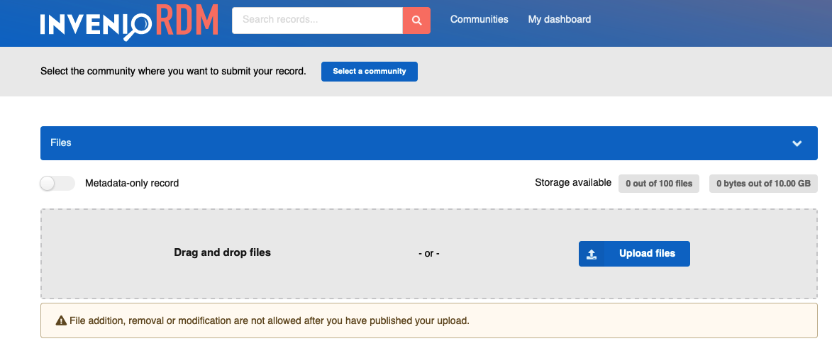
When navigating to the upload form, you should now see your new React component instead of the default:
Other examples
Let's hide completely the 'Metadata-only record'checkbox from the upload form.
It is possible to remove a component using the overridable strategy. In the previous example, instead of declaring a target component MetadataToggle you can simply change the map to:
export const overriddenComponents = {
  "ReactInvenioDeposit.FileUploaderToolbar.MetadataOnlyToggle.container": () => null,
};
The expression () => null above is defining an "empty" component, thus removing it from the upload form.
In order to see more examples in action, you can check the zenodo-rdm repository!